Screenshot or Feature-Callout Graphic? The Image Decision Killing Your Template’s Clicks
It takes a visitor about three seconds to decide whether or not a template listing is worth looking at any further, and almost the entire time is devoted to the one image at the top of the card since that is the only thing they see before reading a single word of the copy.
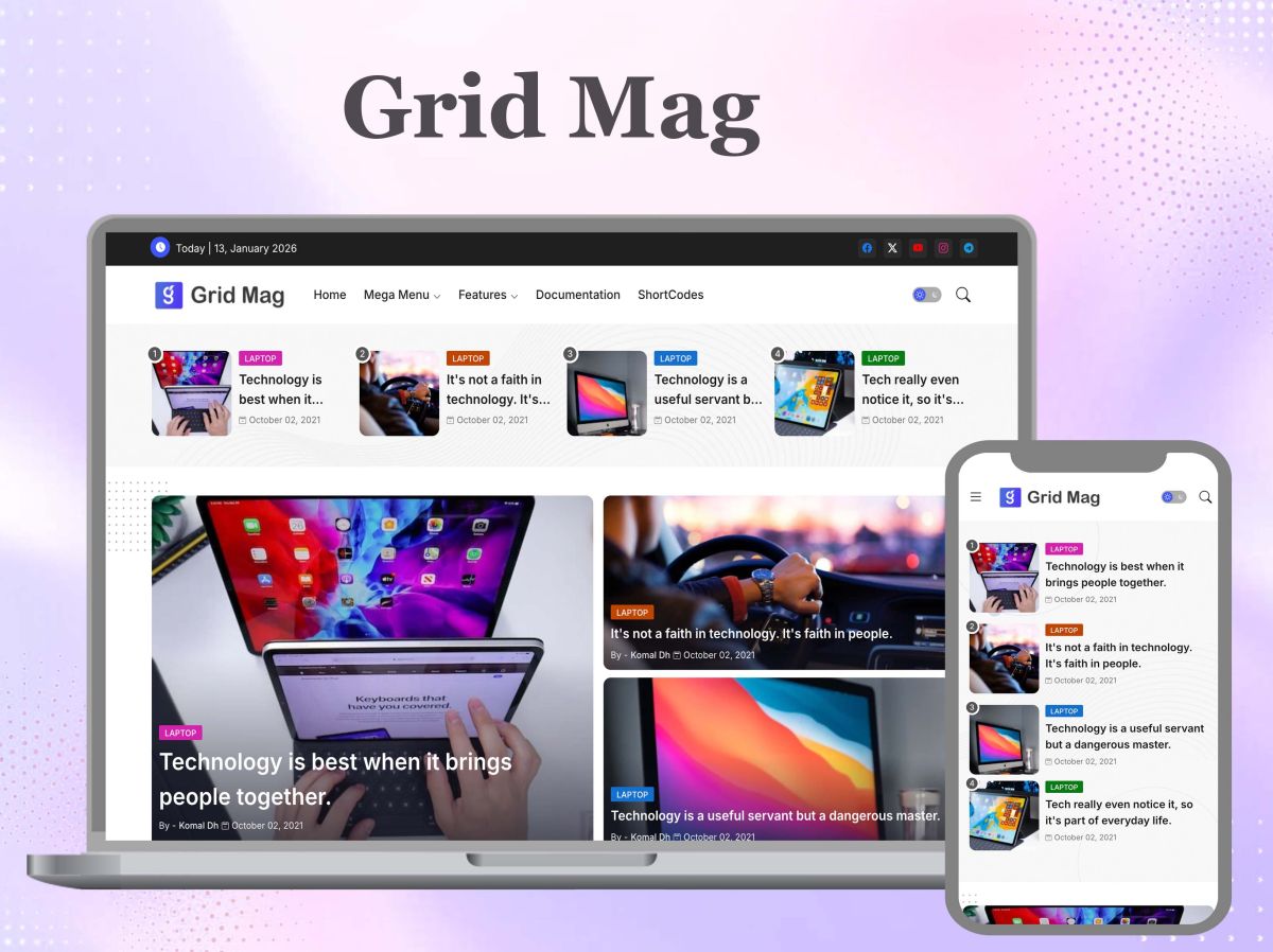
For most template sellers, the image in question is simply a direct screenshot of the homepage since it is the easiest thing to produce and has a certain honesty about it because it exactly shows what the customer will get. The problem is that the screenshot answers a question no one actually asked (that is, what the whole page looks like from top to bottom) and fails to answer the one that was really asked (why choose this one rather than the forty others listed above it).
For approximately 12 months, while using the Pixy NewsPaper 11 Theme, I had the plain homepage screenshot as the store thumbnail, but sales stayed flat despite consistent traffic to the listing—this discrepancy led me to start focusing on the image rather than the copy below it.
What is a listing image actually being asked to do
The small image shown on a store’s page does not act as a preview; rather, it serves as an argument and must justify one template against a dozen others which appear similar within a very short period of time—about the length of a blink. A screenshot is unable to make an argument; it can only offer a report. It shows the header, navigation, sidebar, and footer, giving each equal importance, and therefore tells us nothing in particular.
The bad version and why it fails
What failure looks like in practice is that a thumbnail measuring 489×366 pixels (which is the size of Piki’s own store grid) shows the entire homepage crammed into a rectangle that is only one-third the size of a phone screen. The text in the navigation is unreadable. The hero image in the screenshot turns into a smudge due to compression. All the products on the page are cropped in the same way, so from the third or fourth item onwards, they start to merge into one long grey strip. The image gives the buyer no indication of the differences in this template’s SEO structure, its ad placement, or its mobile layout — since a full-page screenshot reduced to thumbnail size cannot clearly show any individual feature.
The “a screenshot is more honest” argument doesn’t hold up
The main reason for taking a raw screenshot is usually in good faith – it appears to be the simpler choice, rather than using a “designed” image, which might exaggerate features. Yet the buyer is not interested in seeing an actual photograph of the page. Instead, they would like to know what is different about this version. It is more appropriate to show what is being sold by using a feature-callout graphic that emphasizes the real sticky sidebar widget or the real lazy-loaded grid and adds a label than it is to include a screenshot that shows everything but says nothing. Being technically complete does not mean being functionally informative – and a listing image has only one role, namely the second one.
There is another problem concerning honesty that is typically hidden when a screenshot is used: a direct copy of the homepage generally displays the ad slot as it looks in the editor—either as being empty or containing a placeholder—rather than showing how it actually behaves when AdSense begins to serve content to it. The fact that a template reserves an ad slot of fixed dimensions specifically in order to avoid a layout shift upon page loading is a real technical statement, and a screenshot does not show that this claim is being kept. It is the before-and-after illustration based on that one slot that does so.
I create a large number of blogger templates and showcase them on my own website, but the level of user interaction is still not satisfactory. This has actually led to a decline in my sales. That’s when I decided to start using Photoshop and creating the graphic designs myself to promote my products; the problem, though, is that it takes a lot of time. Eventually, I came across tools such as Canva that can be used in a business to generate ready-made designs that precisely meet your requirements. Today, various advanced models, including ChatGPT, Gemini, and Nano Banana, can easily carry out this job for you by simply adjusting the prompt to specify what you want in the output. There are many services like Awesomic’s on-demand graphic design service that cen help you to setup your business.
What it actually costs to fix, by method
Doing this properly does cost something, and the cost changes shape depending on how you make the graphic:
- Using Photoshop, you have complete control over each and every pixel, but each time you create a new template, you have to start almost from the beginning, meaning you have to re-establish the layers, apply the masking, re-crop, and re-export it to the correct dimensions.
- By using a tool like Canva, you do give up some of that control in order to achieve greater speed; the amount of time it takes to produce the second and third graphics is only a small fraction of the time it took to produce the first one, on the condition that you agree to work within its layout system rather than adjusting the pixels by hand.
- A model like ChatGPT, Gemini, or Nano Banana almost removes the need for doing the layout by hand, though it shifts the real skill into creating a prompt that is specific enough to get the desired crop, label placement, and the degree of feature emphasis that you actually need—just as a general prompt produces a general result, so too can a specific prompt produce a useful one.
None of the three options is free. The right question to ask yourself before making a choice is whether the problem lies in the time you have, the degree of control you have over the output, or the number you need to produce each week.
Building the graphic itself
When creating a graphic to highlight the features of a template, it is necessary to concentrate on the one or two features that truly justify the price that is stated — not just provide a general impression of how nice the template looks. For instance, if the real benefit of the template is that it lazy-loads images that are below the fold, the graphic should show this behavior, with the image cropped and clearly marked, rather than showing the entire homepage with the loading state concealed somewhere in the middle. In this case, it is essential to check the crop against the actual responsive breakpoints rather than merely using the desktop view for which the design was made — a callout that appears acceptable at 1440px might become unreadable at the exact width that your customers actually use to browse the site, and Approve Hero Images at Real Responsive Breakpoints explains how to check this before the listing goes live rather than after it’s already underperforming.
The need for consistency across the whole store is just as important as it is for each individual graphic. If each callout graphic uses a different label style, a different crop ratio, or a different accent color, customers will not be able to develop the pattern recognition that allows a well-designed listing page to function effectively at a glance—though the article that deals with the creation of consistent featured images for each Blogger post concentrates on post thumbnails, the basic principle in question—that is, using a single template and deliberately reusing it rather than redesigning it for each post—applies just as directly to a store grid.
You have no need for any knowledge of design if you want to carry this out well. Because Photoshop layers weren’t the original aim, the right approach is to first consider how professional marketing templates can be produced without any design skills when looking at the Canva section of the workflow mentioned above, and only afterward to look at the prompt-based tools for large volumes.
Citron provides a clear example of the different approaches taken—the specific features that distinguish it (for instance, its SEO-structured layout and responsive grid) are so particular that a callout graphic based on one of these will always be better than a full-page screenshot of the same template, since the graphic is carrying out the one task that the screenshot is unable to perform.
The verdict
The first thing that a user will do when they visit your website is look at the visual banners or pictures that you have provided, and the other 10% of the interaction involves your actual content. The main breakdown of how on-demand design works, there are team who handle the issues, giving you solution for your work. In the user’s mind, only visuals are remembered when presented in a creative, enhanced manner, and since these visuals are beneficial for business, they help increase audience engagement. It is far more important to select, create, or choose the appropriate design services—for example, those available from Canva or AI tools—according to your business niche than it is to write the account. I am not promoting any third-party service; this is merely my opinion on how to improve your brand’s reach and value.
A screenshot cannot be regarded as incorrect merely because it is inaccurate; it is incorrect because it answers a question the buyer does not actually have. Only when the image is corrected will the copy below it finally be read.