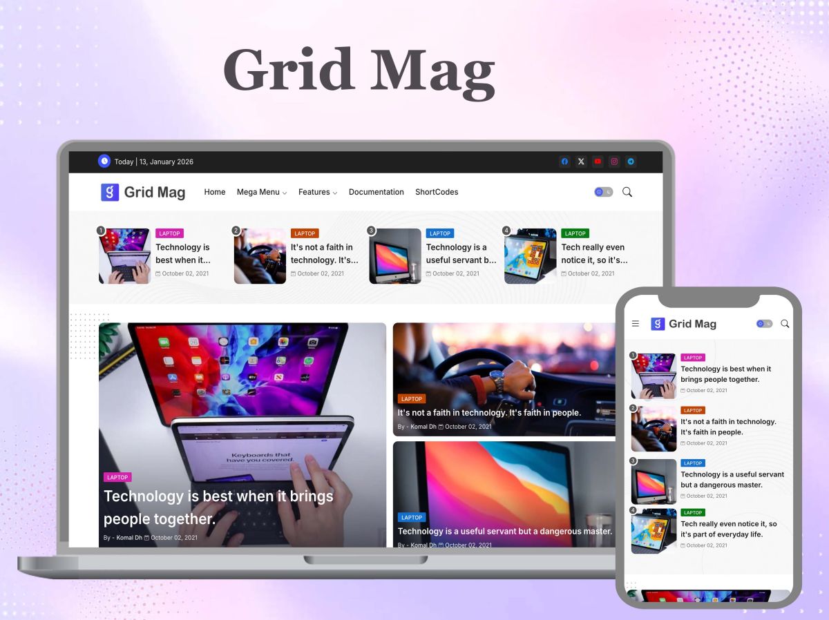
Most of the advice given about selecting a featured image is directed at a template that in reality does not exist — namely, a fictional Blogger theme which displays your image at a single ratio no matter where or when it is viewed. Grid Mag operates differently in that it adjusts the featured image to fit into a box of different sizes at each breakpoint, and on phones the size of that box is more compact than most people expect. If the subject in your original image is not precisely in the centre, the cropping which looked acceptable in your desktop preview will slowly cut away the edges when the article is actually viewed on a phone — a scenario that is common among blogs, since it is usually on a phone that the majority of readers first see the posts.
In reality, I do work as a developer. I receive a large number of emails from different clients for whom I sell my blogger templates, and I look at each of their websites in order to deal with the problems they have. I have found that a great many of my clients or users use images with text either attached to them or positioned in the corners of the images, and when they check the responsiveness of the site on a mobile device or a tablet or on a desktop computer, the images get cropped because, in order to make the website responsive, I have set the object fit cover CSS as the default in the template code. To fix this problem, I tell all my users to use images in which the text is in the centre rather than those in which the text is in the border areas, since it is the latter that cause the issue. The same problem happens with most templates, including Grid Mag.

The article’s structure is that it does not deal with the idea of “images mattering”, instead it concentrates on the precise mechanical reason why Grid Mag’s mobile view shows the wrong part of your image and the specific exporting habit which stops this from happening.
What changes at each breakpoint
Grid Mag doesn’t just shrink the featured image when the screen becomes narrower; it also reorganises the grid, which causes the image box to change its aspect ratio as a result. On a desktop screen the three-column layout gives each thumbnail a wider frame, one that is more in the landscape orientation. When the width is reduced to that of a tablet the columns become two, making the aspect ratio more compact. On a phone you are usually left with a single column and in this case the crop is the tightest and most square-shaped of the three. The image is shown with object-fit: cover in each box and is exactly centred in the middle, so the cropping has nothing to do with where the subject is positioned in the original image; instead it simply cuts even from all four sides until the image completely fills the box that corresponds to the particular breakpoint. A subject that is only slightly off-centre in the original file loses some of it at desktop width and loses even more when you get down to the mobile box, since the mobile box is the narrowest of the three.
The fix that doesn’t actually fix it
The way to deal with this is to pre-crop the image so that it matches Grid Mag’s desktop thumbnail aspect ratio before uploading it, in order that it looks right in the editor preview and you can then regard it as finished. Yet this approach doesn’t work since the aspect ratio used for the desktop is not the one that is sent to most of your readers. You’ve just passed on the problem to a later stage: the image appears correct in the one place you looked at it and is then recropped once again by CSS when a phone requests the mobile version. Pre-cropping the image to a single fixed ratio at the time of exporting will only be effective if the template is designed to show a single ratio — Grid Mag isn’t like that.
Building in an export margin
The true solution is to stop considering ‘crop’ as something that happens only when exporting and instead regard it as an action that the template will carry out at every breakpoint — in that way making sure that space is available when exporting.
- To do this, select the post and, using the device toolbar in the browser inspector, set the view to mobile width and then note roughly how tight the mobile crop box is in comparison to the desktop one.
- Put your subject in a safe area which is clearly smaller than the whole frame—include margins on all sides rather than placing the subject at the edges as is usually advised by the rule-of-thirds for composition.
- Export the document at the same dimensions as it appears in the template rather than at a size larger than necessary—oversizing doesn’t protect the crop, it only makes the file bigger.
- It is better to save it in a modern format—for example, WebP or AVIF—provided that your image source supports these formats—than to use a large PNG or a non-optimized JPEG, since doing so would mean sacrificing page speed.
- When you’ve published it, be sure to check the actual mobile view rather than just the editor preview since the editor does not display Grid Mag’s live CSS.
- Treat the images as a sensitive component of the website by avoiding the assignment of a fixed height or width, because if you do so the images will be squeezed and the problem can then be solved by providing them with actual height and width.
Even if you have no intention of updating the template in which we have solved the image crop issue, you can just centre the text and then recreate the image once more using various tools like Photoshop or Canva or by using AI; you can then use that image since it will fit perfectly on your website.
Where this touches more than just looks
On Grid Mag the advertisement appears directly below the main image in a post, so if the image is badly cropped it is not just a cosmetic mistake—the distorted or image-less picture will end up right above your first ad space, which is exactly the position you want to appear intentional. The same poorly cropped file is generally also used as the og:image for the link previews, and so when the post is shared on social media the subject that has been cut off in the mobile grid will once again appear cut off. One of the export options has an effect on three different places where it is displayed.
If you want to avoid having to deal with a template’s crop behaviour altogether, it’s worth your while to choose a layout that is based on a different image ratio from the beginning—we have already talked about how to evaluate that trade-off if you decide to make the change. And if you’re in need of a more detailed explanation of testing hero images at the actual breakpoints rather than just guessing what will happen when you resize the browser, then this article offers that.
Is it worth the extra step
In my particular instance, I’ve just released an updated version of Grid Mag in which I’ve solved the problem of images getting cropped on mobile devices by using the native true width and height, in such a way that when the site is viewed on smaller devices the featured section of each post that contains an image automatically shrinks equally from all four sides on the smaller screen without the image going outside the expected ratio.
You won’t come across Grid Mag the first time a reader takes a screenshot of your post with their phone if you’re using it. If you’re still not sure whether the other disadvantages of the template are worth overcoming, you should have a look at the product page and the live demo for Grid Mag.