This effect occurs when the design is static and the programming is dynamic.
All the design reviews are at the same time. A Figma frame’s pulled up, the hero image is perfect, the headline occupies the negative space and everyone in the room nods. It is like it was the final approval. It isn’t. A static frame is one still frame at one width, and your users’ browser isn’t obligated to keep that still frame.
Once that hero image is out of that design file, it’s no longer a picture, it’s a variable. It is pushed into a resizing container, a resizing viewport, and a stack of other elements around the image, such as nav bars, headlines, CTAs, reflow without regard to the image. That snug 16×9 portrait at 1440px may end up as a face-cropping mess at 2560px – and that headline could be right in the middle of someone’s eyes at 768px. All that is not visible in Photoshop. Only appears live (in a real browser, at a real width).
Most design teams are unable to close this gap. They give the thumbs up to the picture. They don’t ever say “yes” to the behaviour of the container. And that’s the container that 90% of your users will be experiencing.
How to diagnose Responsive Image Trap
Hero images don’t randomly fail, they fail at some predictable breakpoints for predictable structural reasons. With a little know-how, and some diligence, you can spot each and all of these well before a client ever sees them in the wild. The pitfall always lies here.
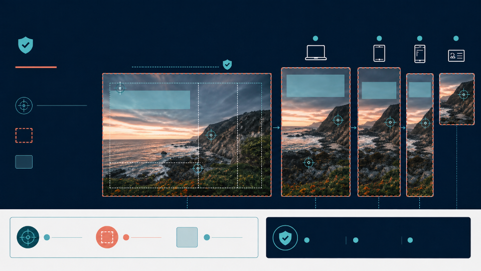
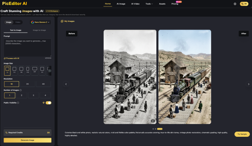
Symptom #1: When shown on a desktop sized screen, the subject’s hands or lower body are cut off the image. Root cause: the container is set to have a fixed or limited height without a set width, so when the width of the container is set to viewport, `object-fit: cover` will crop off the top/bottom to maintain the aspect ratio. There is no fault in the image. The math is just calculating as it is programmed and no one informed it where the subject actually resides in the frame like you can use tools like AI Photo Editor.
Symptom: When the layout is a tablet, the headline text is directly on top of the subject’s face, hence destroying the entire visual impact of the image. Root cause: text boxes sized to be wide on a wide desktop canvas wrap to a second/third line at tablet widths, and an added text box height places the text block in the top/bottom of the zone of interest in the image. The copy didn’t move. The frame around it expanded and expanded into the one area of the picture that was important.
Symptom: Users on mobile are presented with a blank wall, sky or out-of-focus background texture — the thing that they are interested in is missing. The shift from landscape to portrait frame, and the lack of a focal anchor forces the browser to center-crop mathematically, rather than compositionally, discarding what he or she sees on the edges, which is usually the subject. This is the worst of the three as it is the most likely to be a user’s first impression of the brand.
All of the above are coding issues in disguise. There is no point in trying to patch the photo, it will not solve any of them.
Smart Web Architecture and enforcing Layout Integrity
Never approve a static mock up, approve the behaviour of the container. To make a beautiful image live on the web it needs an intelligent web framework.
That’s the rule and there is no deviation from it if you are to get the same results on each device. This is what the mechanic is looking at under it. CSS properties such as object-fit: cover, object-position and viewport-relative units (vw, vh) take precedence over the image in how it fits into the box. A hero image will chop up erratically at each breakpoint if it hasn’t been framed correctly, and if there’s no priority point to lock onto, and no aspect-ratio lock. The same image – dropped into a template that is created using fixed focal points and fixed aspect ratios – will maintain the image composition from the 320px phone screen to the 2560px monitor. The image exactly matches. The outcome is not. It’s the framework that makes the difference.
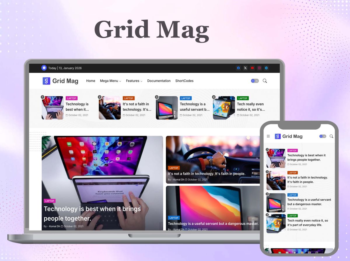
This is where Piki Templates was created to fill in. Rather than each designer manually having to hand code object-fit logic and test focal points at five breakpoints, Piki includes the maths pre-solved within the template’s CSS structure. Their blogger templates designed for SEO come with all the hero containers coded correctly for scaling, cropping and anchoring an image while being responsive, without having to hire a designer to write the CSS code. Grid Mag supports magazine layouts with hero images on top of dense content grids, while maintaining the hero image as the anchor point, when surrounding modules reflow. Crafter is optimized for a lighter, single column design where the hero image is the most important and cannot be compromised, even in small cuts and requires a flawless display.
The bottom line: if you create a template in this manner, you are also assuring your CLS score, as the size of the container is reserved and aspect-ratio locked before the image loads. No jumps, No reflow, No penalty. That’s a Core Web Vitals win, and not one I would say that’s because of the photo but more so because of what the photo is in.
A 3-Phase Responsive Approval Protocol has been developed.
There should never be an approval process for hero images in a design tool. It must take place in a browser, at full width and in a fixed order. Here’s the protocol.
PHASE A – Wide Screen Stress Test.
Open up the live page and examine whether background textures and environmental detail scale smoothly, or whether the browser is zooming/cropping aggressively to accommodate the additional horizontal space, on an ultra-wide or high resolution screen. Here is where subjects lose hands, elbows and shoulders first – before the subject arrives at a client screen, catch it here.
PHASE B: Text-Wrap Collision Test.
Make the browser window smaller and smaller and observe line breaks for the H1 title. Pay attention to what size (in pixels) the text block is at its maximum height and that the extra height does not “bleed” into the focus of the image. It’s a manual, deliberate, drag and watch exercise and should not be based on two or three fixed breakpoints, assuming that the space between is safe.
PHASE C: Mobile Portrait deployment.
Test the page on a real phone and make sure that the crop falls on the photo and not on the empty background. Lightweight frameworks are crucial here: An image with the Wind Spot theme, or one of the many free templates available from Piki Templates, will keep its page weight to a minimum, and allow the anchor logic and the image itself to load quickly enough to make a difference on mobile networks, where a slow hero image becomes invisible.
Always run all three phases prior to sign-off, on each and every new hero image. No at the time of project start up, no more.
Designing for the Live Browser is a critical part of creating a website.
The state of stasis is an easy fantasy, and it’s not the right one. The ultimate goal is fluid adaptability, an image that was created, tested, and finalized with a container at the actual width that your users will see. Using a visual strong and an appropriate designed responsive structure is not just a finishing touch to be considered as an optional. It’s the only mechanism that can attract the first impression of a brand once that image has been exported from the design file and thrown onto the unknown, ever-changing area of the live web.