A design can be finished completely in one’s mind and still collapse the first time a stranger looks at it; the sleeve which looked relaxed on your sketchpad appears sloppy on someone else’s phone, and the print which seemed confident in a close-up looks too small when seen at its real size.
It is a lot less expensive to fill the gap before a pattern has formed and a great deal more expensive to do it after a sample has already been made. The present article focuses on the stage that is situated between these two stages: sketches, flat drawings, four specific tools like Nano Banana Pro, a number of questions that should be asked of strangers, and a live web page which allows you to carry out the whole test on a phone.
I specialize in the creation of templates rather than in cutting patterns, and I shall stick to that area. The only thing I can offer is a testing habit based on web design and a practical method of putting it into action—this involves publishing the concept as a page which can be measured before you have used even a single unit of fabric.
Why a Template Developer Distrusts Screenshots
I make and sell Blogger templates through Piki Templates, and over the years I have carried out a great deal of work on different website designs. Before I launch a template, I never regard it as ready just because I have a screenshot; instead, I have to think about how it looks on both mobile and desktop devices, how easy it is for users to navigate, whether the layout makes sense, how quickly it loads and whether real customers find it useful.
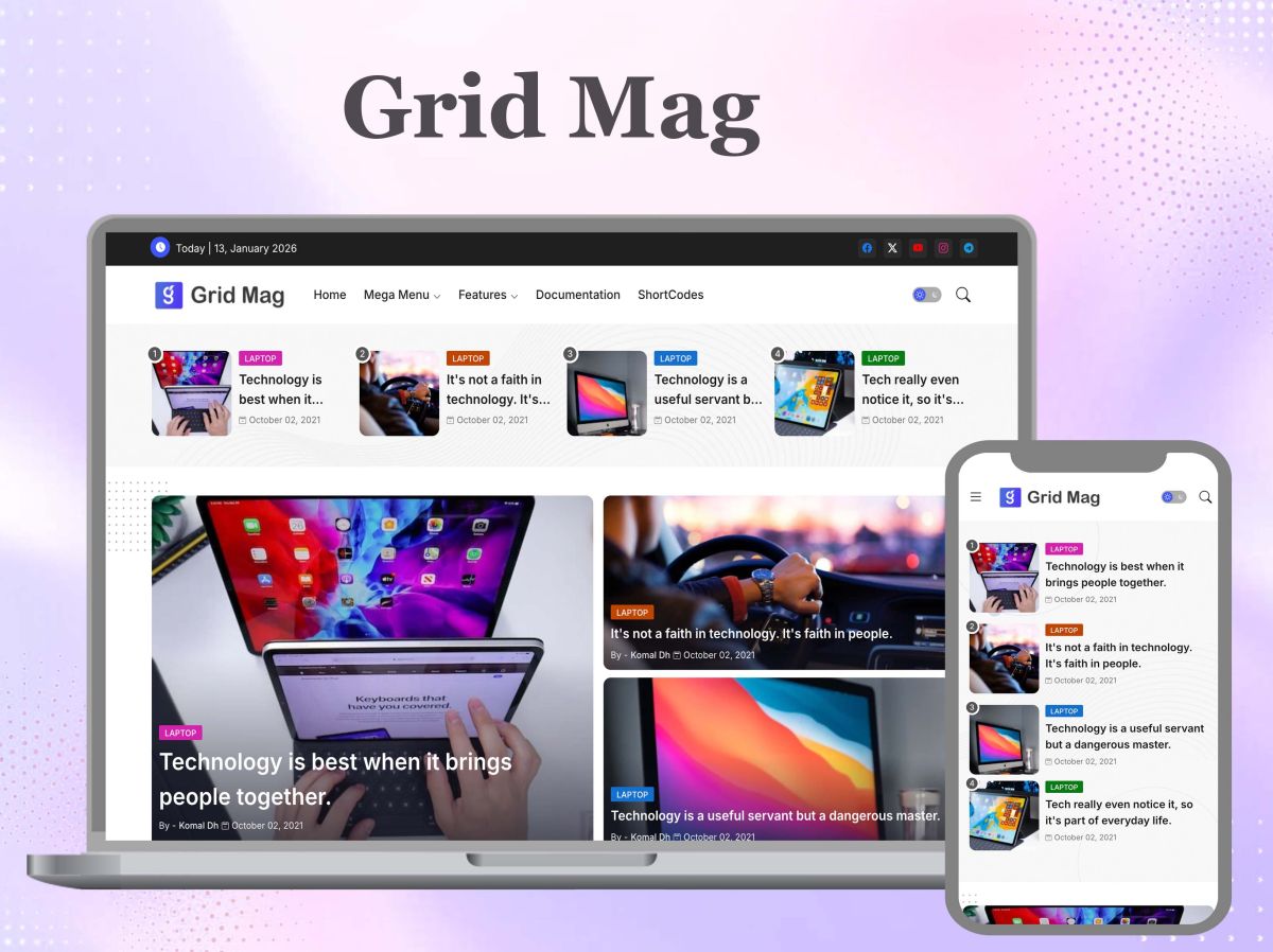
The list has changed my general on design. Although a layout might look impressive from one point of view, a look at the whole interface reveals problems with the spacing, unnecessary elements and sections that don’t co-operate. The designs on Piki Templates have developed as a result of practical testing, performance checks, attention to responsiveness, taking into account customer feedback and ongoing improvements, not because of a single release after the initial visual concept.
The fact that this is so means that most of the templates come with live demonstrations and tools for testing performance. A design should be experienced rather than judged from the standpoint of a static image.
Two other habits carry over. Instead of starting by writing hundreds of lines of code, I start off with the layout, the content structure, the intended audience and the visual direction. Moreover, I make a point of not becoming attached to the first version, because after having looked at your own work for weeks you stop noticing the obvious flaws, which is the reason I stress the importance of getting feedback from someone outside the team.
Since fashion isn’t something that forms part of my day-to-day work, I’ll be honest about the method I use. Nowadays, when I’m working on a fashion design, I first go over the concept before spending money and time on the first physical sample. The rest of the process is according to that plan, including the particular details of the tools which I look at before deciding to use them.
Put the Idea in One Sentence Before Opening Any Software
The fabric can wait; the best thing to do at this stage is to look at the idea, since an idea that cannot be expressed in one sentence is usually incomplete. Express it like this: a [garment] for [a specific person] who [does a specific thing], with the difference from present examples lying in [one visible decision].
For example, the jacket in question is one that has been designed for city cyclists who commute throughout the year, the difference being that the hood folds into the collar; it is this point that allows evaluation whereas “a stylish jacket” does not.
Consider for yourself the sentence in question. What is the primary aim of the design? Who is the garment meant for and what makes it unique? Has the shape been deliberately conceived, are the colours and materials suitable for that type of customer, and does the item appear to be something that people could actually wear?
Express your answer in simple terms; if there is a disagreement between two answers, treat a garment for commuters made from a fabric that creases when folded as being equally costly in terms of expense as a single sheet of paper. You should also note the one point on which you are least sure, since this will then be the first question you ask other people.
All that is required at this stage is a rough sketch—whether it has been drawn by hand or produced digitally—along with a small mood board; nobody needs highly refined artwork in order to realise that the idea is confused.
Build a Clear Visual Direction With an AI Mood Board
Before moving on to the production stage, designers need a shared visual reference that clearly defines the atmosphere they want for the design. The Invideo agent can help out in this early creative stage by employing mood board with AI to turn a written vision into an organised collection of colours, images, and textures using a mood board. Instead of spending time manually looking for references, designers can quickly look at a variety of visual options and thus establish a more definite foundation for their choices regarding materials, styling, and the overall presentation. It then becomes simpler to compare different concepts, communicate their ideas to others, and refine the direction before investing time in the detailed execution.
Draw the Flat, the Back and the Colourways
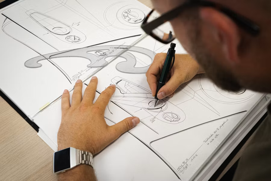
If the sentence has survived, make a digital copy; the correct format is a technical flat – that is, the garment drawn from the front and back in the form of a schematic, without showing a model or any drape, so that the proportions can be judged accurately. You should include the colour variations that are under consideration and draw the details that indicate the design, such as pockets, collars, sleeves, buttons and prints.
It is only when looking at the back view that the real character of the design can be seen. A garment might look excellent from the front but will appear unbalanced when viewed from the back, and a panel line which seemed elegant in one view can look clumsy in the other. The difference becomes clear very quickly if both views are placed on the same artboard at the same scale.
Calculate the right ratio; for instance, if a size M t-shirt has a chest measurement of 52 cm, adjust the artboard width to 520 units so that each unit corresponds to one millimetre. Here, a graphic which is 28 cm would be 280 units, and you can clearly see at once that it covers more than half of the chest—something that a close-up on a screen could never allow you to observe.
The method also holds true when it comes to the position of the pocket, the collar height and the length of the hem: it is equivalent in the case of a garment to checking a template’s full interface rather than just one cut, since something which looks correct at one size might be wrong at another and so the design has to work in more than one situation.
Change One Variable, Then Compare
Don’t work on one design at a time and then rush to make a sample. Rather, produce a number of different versions of the item and compare them side by side. The aspects that are worth changing are the combination of colours, the sleeve or the collar, the position of the graphic, the length, the general shape and the quantity of decorative detail.
In all the versions only one factor should be changed. If, for example, version B has a different collar, a different colour and a lower hem and people still prefer it, then you have not found out which of the options they liked. It is only when the two versions differ in the arrangement of the graphics that you obtain specific information.
There are three versions available—a straightforward version, a conservative one and an ambitious one—so that no one knows which of them you consider to be the authentic one. It is unnecessary to produce further material; the object is to detect the problems while they are still cheap and easy to fix.
Criteria Analysis: Four Tools Judged on What They Export and Allow
The process involves four different tools: Figma for the flat designs and for providing shareable frames, Inkscape as a free vector alternative, Canva for producing quick boards and social media crop images, and Squoosh for the compression stage before uploading. I assessed them according to four verifiable criteria rather than on the basis of how pleasant they appear, consulting the published documentation on formats, settings and licensing as of September 2026. As the terms may change, it is advisable to look again at the licence pages before finally deciding whether to adopt them.
Criteria 1: Export formats you can actually put on a page
Figma exports layers and frames in the form of JPG, PNG, SVG or PDF, and according to its own advice JPG cannot preserve transparency and its compression may damage text, so if any item has labels or measurement callouts it should be saved as PNG or SVG. This is important in the case of flats, since these are primarily made up of thin lines and small type. As WebP is not one of those four formats, a step involving conversion will have to be planned.
The PNG, Inkscape SVG, Plain SVG, JPEG, TIFF and WebP formats are all supported by Inkscape’s 1.4.x export dialog, which means that users can access WebP without having to use a separate converter. On Canva, SVG downloads, transparent PNGs and the options relating to quality, scale and compression are only available on paid plans, so people with a free account can only obtain the basic types of download. Squoosh comes last in this process and takes as its input the output from any of the previous tools.
It’s easy to identify a poor export. When a file is saved as a JPG, thin seam lines and small labels appear with a blurry halo. If an SVG contains unoutlined text, it will use a fallback font on a machine that doesn’t have the desired one. A PNG that is exported at 3x for a page which displays it at 800 pixels wide ends up being several megabytes in size and provides no noticeable sharpness.
Criteria 2: Licensing terms
Inkscape is free software governed by the GPL, and any files that you save or export from it remain the property of their creators and not of the project; this is the best option among the four if the item in question is a brand asset that you intend to use for many years.
Canva requires greater attention to detail since it does not grant any rights over names, people, trademarks or logos that appear in its free content or in standalone items from the library, such as a stock photo used by itself, and such content cannot be printed on products which you sell. Third-party summaries of the licence also state that a logo based on a graphic from the library cannot be registered as a trademark. As for the rule concerning labels, those using library elements are acceptable in a conceptual mockup, but any mark that you plan to register must not contain any.
In each tool, fonts involve a separate licensing issue. A typeface that is licensed for use on desktops is not automatically licensed for web embedding, and Canva’s own instructions when uploading tell you to check that the font’s license permits embedding. If the images you are using include text, then you should export that text as an image or look at the font’s terms before using it in the CSS of your site.
Criteria 3: The settings that decide file weight
In Figma the important settings are export scale, the JPG quality control, and, with regard to SVG, the text option: when exporting as SVG this format provides switches for outlining the text and for including id attributes. When exporting flats, outline the text so that if a font is missing your labels won’t refollow, and only include the ids if you intend to script the file. In Inkscape you should save web-bound vectors as Plain SVG since Inkscape’s SVG includes plain SVG together with extra data in separate namespaces that are used by Inkscape’s own tools and you usually don’t want to include that markup.
With Canva Pro, you can set a size limit in kilobytes for PNG and JPG downloads, making it the feature you should note when working for the web. Users with a free account have no such option and should therefore use Squoosh.
That’s where the weighting is actually determined. The programme operates in the browser, displays both the original and the compressed image behind a slider for comparison, provides controls for quality, effort and resizing, and allows you to export the image in WebP, AVIF, MozJPEG or OxiPNG format. The processing takes place locally, so the images never leave your computer, which is a real benefit compared to upload-based converters in the case of an unreleased product.
A published guide recommends using a quality setting of about 75 to 80 when taking product photographs in WebP, since below approximately 70 the texture of the fabric and fine edges become blurred, and it cautions against displaying the original image at 3024 pixels wide with a width of 120 pixels. Use these figures as a starting basis and then assess your own garments using the slider. For my test pages I aim to keep the hero image under 200 KB and the detail shots under 120 KB.
Criteria 4: Verdict
My choices are Figma for the flats and the frames that you export, Inkscape if you prefer not to have an account and need clean SVG files, Canva for mood boards and for cropping images for social media but not for the master artwork, and Squoosh as a must-use final step for all cases. The principle guiding these choices is straightforward: use the program that has the clearest licence for the asset you intend to keep, and the one that offers the best compression settings for the asset you plan to publish.
The least useful piece of information you will gather will be your own view of your idea.
Ask Strangers Questions That “Nice” Can’t Answer
Take the concept to a small group that is similar to the target customers and instead of asking them if they like it, ask what they notice first, whether they would actually wear it, what changes they would make, if it looks comfortable or awkward, and what kind of person they think it was designed for.
The most informative of all the answers is that one: if people imagine a kind of customer different from the one you had in mind, then the issue you have is a positioning problem, not a taste problem.
Usually, between five and eight individuals who match the target customer will bring up the recurring problems; if the concept has two separate audiences, increase the number to ten or twelve. These are the figures I use in practice, not a statistical rule. You should note the answers in the customers’ own words and then count how many times a particular point is mentioned, since the fact that one person dislikes a collar is just an opinion but the fact that four people mention it without being prompted constitutes a finding.
Gather the answers using a form rather than a chat thread so that no one reads another person’s reply before posting their own. When you create the page using the Shopping theme, the feature that allows bookmarking the love item can be easily mistaken for a vote counter. The description of the theme states that bookmarks are stored in the visitor’s browser local storage, which is the reason why the page does not become slower, and it also means that the data remains with each visitor unless you include your own tracking.
Hand the Flat to Someone Who Sews for a Living
A product can fail to be a good idea for manufacture even if it passes all the visual inspections. Before cutting any sample, you must in writing answer the following questions: is the fabric appropriate for the design, will the garment be comfortable, can the seams be properly produced, is any feature more complicated than is necessary, will it appear correct when seen in the actual material, is the method of construction realistic given the production method you have access to, and does any component add to the cost without also adding value?
I am not in a position to reply to such questions from the point of view of a web developer, and I won’t feign that I am. This is why the patterns should be sent to a pattern maker or manufacturer for them to review. The standard document is known as a tech pack, and it includes the flats, the key measurements, the materials, the colour options and the construction notes; even a preliminary tech pack enables the maker to identify a panel which wastes fabric or a stitch detail that requires a machine they do not possess.
Make sure that each of your answers relates to your one-sentence concept; if the maker’s solution gets rid of the one obvious choice that the item was based on, you should realise this at the time, even though the remedy involves sending an email rather than carrying out a reorder.
The Phone Test: Where the Concept Meets a Small Screen
Since most people view your concept on a phone, the page has to test the images as well as the garment. Two flat layouts placed side by side on a laptop can be arranged in a single column when the width is 360 pixels, and as a result the back view ends up below the fold, which is precisely the view that people fail to evaluate.
Check the hero image the same way you would check a template—by doing so at real widths in a real browser, not in the design file. The crop and focal-point checks mentioned in the ‘Approve Hero Images at Real Responsive Breakpoints‘ section apply directly to a lookbook hero. To do this, open the device toolbar in Chrome DevTools, drag the width from 1440 px down to 320 px, and observe how the crop affects the garment.
Do this on an actual phone; if a thin seam line disappears on a small screen then the flat area needs a heavier stroke, and that’s a design choice which your file would never have informed you about.
Deployment Directive: Getting the Concept Test Live on a Piki Templates Theme
Two Piki Templates themes are suitable for this purpose. The Shopping theme has a store-and-cart layout with product sections and price and discount shortcodes, enabling it to display the price of the garment. The Missile theme is a one-page portfolio design featuring a slider and scroll animation, making it appropriate for a lookbook-style presentation of the front, back and colourways.
The free version is offered on both product pages, both are marked as having a responsive layout, and both download as a ZIP file containing an XML theme file together with the documentation. The Shopping page also provides links to PageSpeed Insights and the Rich Results Test for its demo blog, enabling the speed and structured-data claims to be verified rather than just accepted. When neither of the layouts is suitable, the responsive template category gives a list of other options.
Work through these in order:
- For concept tests use a separate blog so that a test never affects a live theme and make sure to back up the current theme first: log into the Blogger dashboard, go to Theme, click on the arrow next to Customize and choose Backup. Check that an XML file is in your Downloads folder and that it can be opened in a text editor.
- Go to the product page, download the theme ZIP file, unzip it and use the same menu to restore the XML file, then refer to the installation instructions on the documentation page that is linked from the product page. Check that the homepage displays with the new layout and that, when viewed at 360 pixels wide in DevTools, both the header and the menu remain usable.
- Prepare the images by exporting the flats and mockups from Figma or Inkscape at display size—about 1600 pixels wide for the hero image and 800 pixels wide for the details—then use Squoosh to convert them to WebP format at a quality level of 78. The files should be named in lowercase with hyphens, for example concept-a-back-charcoal.webp. Make sure that each file is within the budget as specified in the criteria section and that the comparison slider displays no softening of the seams or fabric texture.
- Make the test a Blogger page: choose Pages and then New page, giving it a name corresponding to the concept, for example concept-a, and assign a custom permalink. Make sure that the address is something like /p/concept-a.html or the slug that you have selected.
- In Compose view upload the images and select a preset size instead of Original size; write alt text which describes the garment for example “Back view of version B: cropped boxy jacket in charcoal”. If Blogger rejects or re-encodes a WebP upload then use the MozJPEG output from Squoosh as a fallback. Check that in the DevTools Network tab each image transfers at or within your budget.
- Arrange the price or the reveal. On Shopping, use the shortcodes for the price and the discount exactly as they are shown in the documentation in order to find out what people expect to pay. On Missile, include versions A, B and C in the slider. Make sure that, on the live page, the price appears as a price and not as raw shortcode text.
- Insert the feedback form. To do this, in Google Forms select Send, then click on the embed tab, copy the iframe code and paste it into the page while in HTML view, making sure you use the five questions from the feedback section. Check by submitting a test response from your phone and verifying that it appears in the Responses tab.
- Make sure that the page is not included in search results and that there are no advertisements. To do this, go to Settings, select Crawlers and indexing, turn on custom robots header tags and then apply noindex to the page. With Shopping, ads are inserted using custom shortcodes in such a way that an ad appears only at the place where a shortcode is inserted, so in order to have an ad-free test page you must insert no shortcodes at all. Verify that the page source or the response headers show noindex and that no ad slot appears.
- Carry out the performance check by pasting the live URL into PageSpeed Insights and then opening the page once on an actual phone using mobile data. Make sure that the report identifies your hero image as the Largest Contentful Paint element and that its LCP is 2.5 seconds or less, since that is the threshold Google considers to be good.
- Give the link to your five to eight testers, fix a deadline (seven days is a reasonable default), and state your decision rule before the first response comes in. For example: if less than half of the testers identify the audience that I designed, then I will amend the concept before any sample is produced. Check: the rule is written down and dated before the form receives any responses.
Order the Mistakes by Price
A sketch may show an idea problem, a digital mockup may show a proportion problem, feedback may show a customer-perception problem, and a technical review may show a manufacturing problem.
The physical sample only obtains its cost once the four filters have been applied, after which it has a more limited role; you must check the fit, the proportions, the way the fabric behaves, the stitching, the comfort, the color, and the construction, and then compare the garment with the original concept. If anything doesn’t work, the sample hasn’t failed; it has instead told you something that could not have been discovered any other way.
That’s the biggest lesson my template work has taught me: the first version is often there to show you what the final version should become. The process above is a Blogger template’s development cycle with the vocabulary swapped: build a version, test it on real people and real screens, learn, and revise.